I had to think of my Grandfather today. He was an inventor, a chemical engineer, he worked on the Manhattan Project, on the Apollo 11 Project and he filed many, many patents in his lifetime. I always wanted to be just like him when I grew up.
I collaborated with him on one project when I was in college. We designed a folding chair together and we talked a lot about design. Because he was a physicist and a mathematician, I always assumed that he was a science geek. But when I did a Google Patent search for some of his patents, I found out he was really a designer and an artist at heart.
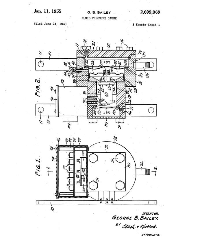
Maybe the apple didn’t fall far from the tree after all — we filed for a provisional patent today and all I could think is that I made Grandpa proud.
George B. Bailey’s patents (1928-1964) from Google Patents:
Automatic Drier Control, 1928 (G.B. Bailey)
Power Transmitting Apparatus and Control Means, 1934 (George B. Bailey)
Hays Gas Analyzer, 1948 (George B. Bailey)
Pressure Sensitive Device, 1952 (George B. Bailey)
Fluid Pressure Gauge, 1955 (George B. Bailey)
Garrett Co. Method and Apparatus for Attenuating Helical Acoustic Pressure Waves, 1964 (George B. Bailey)
Martha Stewart—love her, or roll your eyes at her. As a graphic designer, I have to say that I fall into the ‘love her’ category. Martha and Lorenzo de Medici have a lot in common: both are known as despots and patrons of the arts. I don’t believe that being a despot is all bad. If you have creative vision, you have to fight a lot of mediocrity to see your vision realized (hello, Steve Jobs?). Martha’s management style may not be as extreme as Steve Jobs’, but the results that both achieve with their creative teams is extraordinary.
I love that Martha has fully embraced all things digital. She was an early adopter of blogging and tweeting and now digital publishing. The aesthetics of Martha Stewart Living Magazine are perfect for digital user interface design—minimal, graphic and modern.
The iPhone UI is the most challenging for designers because of the small screen size, but the new iPhone app for Everyday Food is intuitive, simply designed and photo-driven.
The new version added a nice gaming mechanism with the Recipe Shuffle feature. It’s almost as addictive as Angry Birds.
Where Martha Stewart Living really shines is on the iPad. The larger format allows for large format photography and beautiful typography with the added bonus of embedded video and animation.
For a publication like Martha Stewart Living, the digital platform is an excellent medium to leverage their existing content, capture a new audience and monetize all at the same time. Like I said, Martha and Lorenzo de Medici.
The excellence of Martha’s jump into digital publishing reminds me why both Martha and Marcia (The Brady Bunch) inspire such envy.
There are so many great utilities available on the web if you choose to spend a little time navigating the aggregator sites. Gawker is one of my favorite sites to find humorous takes on current events. But, the article word mapping Mel Gibson’s x-rated rants was actually amusing and useful. Wordle.net is an ingenious editing tool. I love that wordle creates a visual map of your writing, allowing you to see the hierarchy of the most-used words. The above image was generated from the first paragraph of my blog Brand Like Andy and I think Andy would have liked it since the biggest word is Andy.
If the details of design management can wait for your fall reading, then your summer reading list should includes Terry’s knitting/design blog sknitter or her newly released cookbook Booze Cakes, reviewed as a combination between “Betty Crocker and Betty Ford.”
In 2008, Sun Microsystems decided it was time to apply to the Great Place to Work Institute® for consideration in the Fortune 100 Best Companies‘ ranking. The application and employee video Fibonacci Design Group created became the launch pad for building a companywide employee brand. The messaging for the campaign had yet to be developed, but in viewing executive video after video and interviewing Sun employees, the message appeared organically from them, “I have the best job at Sun.”
It seemed that everyone at Sun had the same feeling about the company and wanted to tell you why they had the best job. Arguments can fly about how Sun Microsystems performed financially or strategically in the marketplace, but there is no argument about the enthusiasm and commitment that Sun employees had for the culture, mission and innovation of their company. Here is a peek into the culture of a ground breaking company from the voices of the employees who loved it: I Have the Best Job at Sun.
My parents moved a lot. Somehow they always moved somewhere that involved packing the cars and driving across the country, or at least through a couple of states. The only thing that saved my sanity on the long car rides was reading. In 1978, we moved to North Carolina from Colorado and I read James Clavell’s Shogunthrough Kansas, Missouri and Kentucky.
Now that Apple has released the iPad, I reminisce about the summer of ’78 and think what would I have packed onto an iPad? The thought of having such an amazingly powerful tool for remote entertainment on those horribly boring car rides staggers my eleven-year old brain. Please excuse the time travel. Speaking of time travel, I wonder what I would have loaded onto my iPad circa 1978? Hmmmm, lets see.
My iTunes library would have had a few gems from the late ’70s.
Donna Summer’s Last Dance
Paliament’s Give Up the Funk
Linda Ronstadt’s Blue Bayou
Paul McCartney and Wings’ Silly Love Songs
I would have listened to Shogun as an Audio Book from iTunes and downloaded a few classic ‘70’s TV shows and movies from iTunes.
Jaws–best summer movie ever made.
Airport ‘75–they always tell you that mid-air collisions are impossible. And, Karen Black as a pilot, come on.
The Adventures of the Wilderness Family–cheesy, but I had fantasies of escaping my family and living in the woods.
The Exorcist–because it captures the awkwardness of Junior High School.
“Always make the audience suffer as much as possible”—Alfred Hitchcock
Alfred Hitchcock’s movies offer some of the most watchable moments in film history. Hitchcock seduces the viewer with beautifully crafted scenes, sharply constructed dialogue and dynamic camera work. His plots are always elegant, suspenseful and intelligent.
What is often noted in his work is the use of the MacGuffin. In film, the MacGuffin is an object or reference presented to the audience at the beginning of a movie, usually in thrillers, to drive the plot and pique the curiosity of the viewer (it’s also, interestingly, an encryption algorithm). As a plot device, the MacGuffin can be meaningful or meaningless. To me the overlooked MacGuffin in Hitch’s movies is his use of color as a tool for narration.
Color is the Bomb A great description of Hitchcockian suspense is the Bomb Theory. If a filmmaker has a scene filled with people milling around talking it’s pretty boring, right? If that filmmaker takes the same scene and cuts to a ticking bomb in the same room, you have a boring scene transformed into a suspenseful one. Color is the bomb in North by Northwest.
North by Northwest’s production designer Robert Boyle created a palette grounded in tone-on-tone shades of cool gray or beige which dominate in moments of calm and punches of primary color used in clothing, props and sets to indicate danger or safety.
Lets take a look at a few instances. The color base for the film’s interiors are either gray on gray or beige on brown.
A great example of the beige tone on tone set design
Roger Thornhill (Cary Grant) on the train shows a combination of gray and beige
The Chicago hotel room is the most beautifully subtle of the gray on gray color themes
Of course, red is the color that tells the viewer that something dangerous is about to happen.
Red appears in the cab as Roger Thornhill heads to a meeting where he is kidnapped
Note the splash of red in the bookbinding behind Cary Grant's head just before he is to be murdered
The kidnappers leave the hotel in a red cab
Roger Thornhill is pursued leaving the train and is disguised in a red baggage man's hat
A woman in a red sweater appears in the cafeteria at Mt. Rushmore where Roger Thornhill is to be shot
In North by Northwest, green is the color that represents escape or safety.
Here we see Hitchcock in his cameo getting on a green bus during the screen credits at the beginning of the film
Roger Thornhill and his mother leave the jail where Roger has just been released in a green cab
The truck that ends up being Roger Thornhill's escape from the crop duster is green
Here we see green appear in the villain's vest. But, Philip Vandamm is being duped here and Roger ends up escaping the meeting by being shot with a blank and leaving on a stretcher.
The prop ambulance that carries Roger Thornhill away is green
Interestingly, Cary Grant’s costume remains the same throughout the movie until the end when he changes his clothes in the hospital. Eva-Marie Saint’s character Eve Kendall has an ever-changing color palette to signify which role she is playing as a double agent.
When Eve Kendall is helping Roger Thornhill, she wears white
When Eve is playing both sides of her double agent duties, she wears tone on tone gray
When Eve is in the most danger she wears not red, but dark orange
In the final scene of the movie, as Roger's wife, Eve wears white once again
I want to have Don Draper’s talent and Roger Sterling’s dialogue.
AMC’s drama Mad Men hits way too close to home in all the painful places. Creator Matthew Weiner so accurately captures the thrill of victory and the agony of defeat that creatives go through regularly day in and day out. The agony could be softened if all of us had Roger Sterling’s silver fox good looks and verbal acuity.
“I shall be both dog and pony.” — Roger Sterling
For anyone who has ever had to submit to the humiliation of a cattle call, you dream of Roger Sterling going to bat for you.
Sometimes you have to jump off a cliff.
The third season finale of Mad Men was the super bowl fantasy football game for anyone working in advertising and the ultimate coup for the small business owner. Forget the melodrama of Don Draper’s personal life; his victory is in the office. With the current recession providing never-ending stories of layoffs and mergers that generate more layoffs, who wouldn’t root for Don Draper jumping off the cliff?
“We’ve been robbed!” — Don Draper’s secretary
What is so fascinating about the writing for Mad Men is how today’s current business climate is so artfully woven into the storyline of Sterling Cooper’s business. In the last season of Mad Men, Sterling Cooper’s purchase by an international conglomerate sets the stage for a revolt by the real assets of the company—the talent. How many employees stuck as pawns in a merger would love a weekend raid of the files and the clients that they worked so hard to cultivate? Who is being robbed here? The value of a company is not the money in the bank, but the talent, dedication and hard work of the employees who make up the company.
I want to work.
The most telling exchange concerning the tension of creativity and business occurs in the last episode of Mad Men, Shut the Door. Have a Seat. Don Draper confronts Bert Cooper about the second acquisition of Sterling Cooper, revealing that if you are creative, you want to be free to create.
Don Draper: “Who the hell is in charge here, a bunch of accountants trying to make $1.00 into a $1.10? I want to work! I want to build something of my own.”
Bert Cooper: “I’m not sure you have the stomach for the realities.”
The realities of starting an agency will be revealed in the next season of Mad Men, but I am sure that Matthew Weiner and his talented writers will keep it honest and addictive.
If ever there was a branding genius it was Andy Warhol. As an artist with a background in commercial illustration, he instinctively designed his life, becoming one of the most recognizable brands of all time. His artwork featured famous brands—both people and products.
Andy used social media before there was social media. He would be tickled pink that blogging and tweeting have made everyone a superstar. It’s easy to picture him responding to the online world of self-promotion the same way he responded to the publication of the Serendipity cookbook, “Oh wow.”
Naming
Andrew Warhola becomes Andy Warhol.
Memorable Tagline
“Everyone will be famous for 15 minutes”
Eight Elvises, 1963. Sold recently for $100M.
Brand Management
Good brand management creates perceived value for the product that will exceed the cost of production.
Andy Warhol with President Carter, 1977.
Advertise
Create a perception of your brand that it is special and unique.
Studio 54, mid-1970s.
Publicity
Any press is good press. As Andy would say, “Don’t pay any attention to what they write about you. Just measure it in inches.”
Traditional media companies and movie studios now find themselves at a disadvantage in the entertainment marketplace. New technologies in computer architecture, software and digital delivery systems have given the upper hand to creatives. Writer/director Victor Bornia’s newest project, Darkening Sky, is an exciting example of the new creative power of the artist in the digital age.
Narrowcasting and the Effectiveness of Social Media in Marketing
The advantages offered by yesterday’s costly marketing and advertising plans have evaporated. Why guess what your audience wants when you can ask them to participate and give feedback? Narrowcasting—advertising to a very targeted audience—paired with the use of social media has removed much of the marketing guesswork. YouTube, iTunes, Twitter and Facebook make it possible for the independent filmmaker to advertise and distribute a film without the 100 million dollar marketing budget once required.
Paramount recently used this strategy for Paranormal Activity to generate demand in specific geographic locations, and to allow the audience to determine a distribution plan for them. Utilizing free social media applications and targeted online advertising, Paramount has generated $103,690,184 as of Nov. 15, 2009 from a movie that cost a mere $15,000 to make. That’s a pretty good rate of return on their investment. Profits from many independent movies have out paced bloated big budget studio movies (think Universal’s $100 million stinker Land of the Lost).
Darkening Sky: A Perfect Storm of Talent and Opportunity
Advanced technology cannot replace talent or experience. With a background in visual effects and computer animation, Victor Bornia is marrying artistry and storytelling with cutting edge technology. The other strategic component that he has added to the mix is an alien abduction/conspiracy storyline. The multitudes of online sci-fi communities are a testament to the strong audience that is awaiting Darkening Sky‘s well-crafted story. Using Facebook, Twitter and an engaging website, Darkening Sky looks to have all of the right pieces in place for a very successful launch.
An Interview with Victor Bornia
What inspired you to take on this project? I wrote the screenplay, so…I was biased! My writing tends to focus on the dark side of human relationships; I also find alien abduction phenomena fascinating. Darkening Sky is the result, basically a twisted psychological drama wrapped in an alien abduction thriller…two of my favorite things.
How have hardware and software advances helped you in the editing room? And what equipment and programs are you using? New technologies not only made this film possible at all, it raised the bar on what we could achieve with the resources we had. We were very fortunate to shoot on the Red One camera with a brilliant owner-operator DP who really understood the ins and outs and gave us gorgeous imagery. The film is being edited in Final Cut on a quad-core Mac Pro tower with gobs of RAM and acres of hard drive space — all of it just laughably affordable these days (~ $100 for freakin’ 1.5 terrabytes?). I’m a long-time After Effects user but am doing a lot of VFX work in Motion, which has a lot of surprisingly sophisticated tools. I’m also an old-school Lightwave 3D user (how I made my living), so that’s the tool for 3D, rendered on a trio of Frankenstein hot rod PCs I built for my work.
Do you believe that independent filmmakers have any advantages in the current media market? I’d say being truly independent has brought us all the advantages of light vs. heavy, small vs. large. There are pros and cons on both sides, of course, but the biggest advantage is that we’ve been able to move from concept through to near-completion very quickly; there aren’t a lot of layers to sift through on creative and business decisions (more like a phone call with my partner). Less waiting is good.
How important is a producer to the independent filmmaker? A producer makes sure that a film actually gets made, so the answer would be, “indispensable.” BUT: that’s not to say filmmakers need to sit on their hands and wait until some Big-Deal Producer grants permission to make a movie. It wasn’t really until I realized that I would need to “become a producer” myself that things started to break loose… Still, this was definitely a co-production with my partner Karly Young. She handled SO much and made it possible for me to even “think like a director.” Couldn’t have done it without her.
How are you using viral marketing/social networking in promoting this project? Marketing is actually Karly’s main area of expertise, so I’ve been able to stay focused on the film itself. So far I think we’re using social networking pretty basically, to share what’s going on as things develop. Once the film is finished, I’m sure our online presence and interaction will become a much more significant part of what we’re up to.
Who are your 5 favorite directors? That’s a tough one. David Lynch, Ridley Scott, Adrian Lyne, Martin Scorsese, Paul Thomas Anderson are probably the easiest choices for me… I don’t love everything they’ve done, but they made my all-time favorite movies. There are many others, but those are the people who have consistently delivered things I enjoy and am inspired by.
What are your 5 favorite sci-fi films? Blade Runner (by a mile); then probably The Matrix, A Scanner Darkly, Dark City, and Terminator. Honorable mention: 12 Monkeys.
***
Victor Bornia Answers James Lipton’s Inside the Actor’s Studio Questionnaire
What is your favorite word? Evocative.
What is your least favorite word? Edgy.
What turns you on? Vulnerability.
What turns you off? “Sexy” behavior.
What sound or noise do you love? Pipi (our girl pug) snoring.
What sound or noise do you hate? False indignation.
What is your favorite curse word? Fucktard.
What profession other than your own would you like to attempt? Novelist.
What profession would you not like to do? Medicine.
If Heaven exists, what would you like to hear God say when you arrive at the Pearly Gates? “Sorry, we need to send you back.”